Want AI Content That Doesn’t Sound Like a B
Your audience doesn’t care if your content was writte...
One of the hardest parts of building an agency website isn’t design.
It’s deciding what to say first.
You’re trying to:
ALL of that has to happen… above the fold.
I’ve been looking at how different agencies handle that moment.
Here are 3 patterns I’ve seen agencies use well to make their hero sections work harder 👇
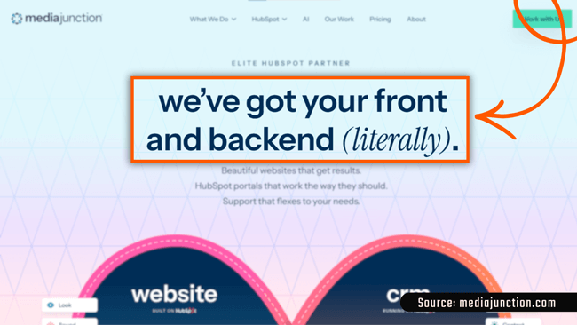
Media Junction uses their hero to reinforce the value proposition in a way that sticks:
WHY THIS WORKS
If people can repeat your value proposition after one read, your hero is doing great work.
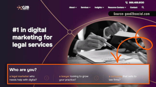
Good2bSocial uses their hero to ask who the visitor is and adapts the journey from there.
Instead of talking at everyone, they segment immediately.
WHY THIS WORKS
This does two important things:
1) It lowers cognitive load (“this is for me”)
2) It lets the visitor self-select instead of guessing
That’s not a design choice. That’s conversion architecture.
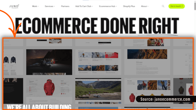
Juno Ecommerce uses striking visuals and a looping slideshow of real ecommerce sites to demonstrate the outcome they promise (before asking you to believe it).
WHY THIS WORKS
Curious how other agencies think about this:
What’s one thing your hero section does today to make your value clearer or your buyer’s decision easier? Comment below!
Always interesting to see how different teams approach it.
Gateway to AI Adoption. This is the Future of Marketing.
Your audience doesn’t care if your content was writte...

ChatGPT Enters the Ad Era: What OpenAI’s New Test Mea...
Every week, we spotlight the indie launches that didn�...